Writing a Resume
A resume or a CV is an important tool in acquiring the employment of your dreams. It is an advertisement of your skills, qualifications and experience. If not advertised properly, you may lose the chance of getting a good job (along with a good salary). A resume should showcase your talents, abilities and achievements in a way that it attracts employers towards you.
There are many templates and formats available on the internet these days for putting together a resume. Some are helpful, whereas, others are confusing. For those who feel lost in the tangled web and wonder what to follow and what not to include, following are some tips that give proper guidance for assembling a good resume.
Tip # 1
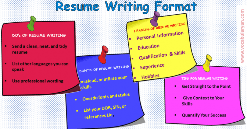
At an average, most employers spend less than a minute to skim through each resume (from a pile of resumes). They do not have the time to sit and read your life story. A good resume should, therefore, be short, precise, relevant and well-presented.
Tip # 2
Make sure you mean what you say and you say what you mean. Having seen thousands of resumes in their careers, employers can tell exactly which vocabulary you have copied and pasted in your resume from somewhere else. It doesn’t give a very good first impression of you. So, try not to be a copycat and exhibit originality and individuality in your resume. You want to set yourself apart from others, and not get lost in the crowd. Avoid using conventional words and choose words that reflect you more, instead.
Tip # 3
Try to avoid sending a generic resume everywhere. You should tailor your resume according to the individual requirement of each company. Find out the skills and expertise each employer is looking for and change your resume to fit that demand. This effort is often appreciated by employers. A generic resume on the other hand, makes it look like you are non-serious and lazy.
Tip # 4
Keep your resume updated. There are people who make a resume and consider it a word of God. They keep circulating the same resume for decades and wonder why they are unable to get a good employment. Review your resume every six months (whether or not you’re looking for a new job). See what improvements and changes you think will further improve it. Maybe there is a new skill that you have acquired that can add a sparkle.
Tip # 5
There is no right or wrong format or template when it comes to resume writing, so try not to fall into that trap. There are thousands of formats and templates available on the Web these days. The right one is the one that suits you (and the one that you like). Just remember that the simpler the better. It should be easy on the eyes and help the reader navigate through the whole resume quickly. Complicated and fancy formats are distracting and only make it difficult for the reader to focus on the content. Remember, no matter which format you choose, the font should be between 10 to 12 points in size. There is no hard and fast rule as to the type of font that must be used, as long as it is clear, simple and easily readable. Fancy and complicated fonts should be avoided at all costs. Some recommended fonts are ’AriaT, Times Roman’,
‘Calibri’, ’Trebuchet MS’, ‘Bookman Old Style’ and ‘Century Gothic’ in MS Word.
Tip # 6
Try to avoid including details that are too personal. No one needs to know your medical history, your religion, your relationship status, the number of children you have, or your Facebook and Twitter page links, at this point. There will be plenty of opportunities for you to share this information once you get hired. Also try and avoid giving personal email addresses in your resume that are too informal, like ‘hellokitty79@hotmail.com’. They certainly do not give a good impression of you. Also remember that photographs are not a compulsory part of a resume. Unless there is a photo in which you’re looking exceptionally professional and handsome, do not entertain the idea.
Tip # 7
Make sure to proofread your resume thoroughly before mailing it out. There should be no spelling mistakes or rough edges that may make it look like a lousy and effortless job. An error-free resume gives a good impression and is a pleasure to read. Also make sure that the language used is simple, but not informal in any way.
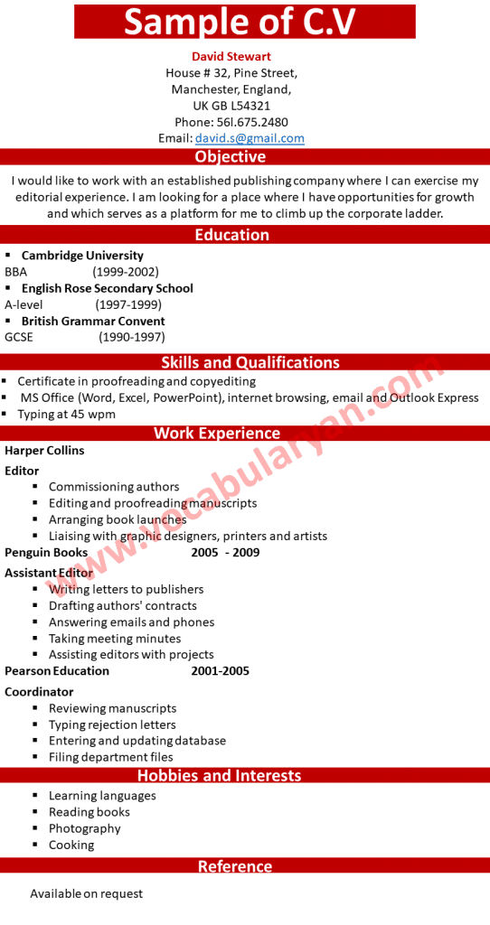
Following is a sample format of a resume. David is an editor at a publishing company in UK and is looking for advancement in his career. The font size used throughout is ll points (except the name of the person used as a heading is 26 points) and the font type used is Century Gothic’ in MS Word. The format is simple, clear and clutter-free, with standard spacing. You are free to make whatever changes you would like for it to suit your needs.


Leave a Comment