
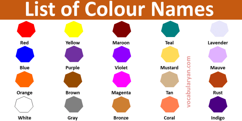
Colors are the visual sensations produced when light of different wavelengths reaches the eye, from primary red to specialized neon and pastel shades. English color names have 16 main shade-family categories.
English color names have 16 main shade-family categories: primary, secondary, shades of red, shades of blue, shades of green, shades of yellow, shades of orange, shades of purple, shades of pink, shades of brown, shades of grey, neutral, metallic, pastel, neon, and rare and unique colors.
Common Color Names With Pictures
Each category is defined by shade family or usage type. Primary colors are the three base colors that cannot be made by mixing others. The other 15 are secondary colors, shades of every base color, neutrals, metallics, pastels, neons, and rare and unique color names.
Primary Color Names in English
Primary colors are the three base colors that cannot be made by mixing other colors together.
Red
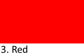
pure primary color at the long-wavelength end of the spectrum, associated with fire and blood. Red raises heart rate when viewed, and used for stop signs, fire trucks, and Chinese New Year lanterns.
Blue
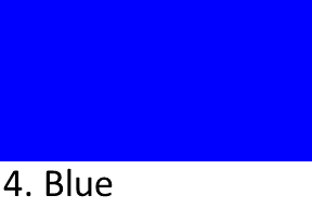
pure primary color of sky and water, associated with calmness. Blue is the most-popular favorite color worldwide, one of the three primaries, and used in more flags than any other color.
Yellow
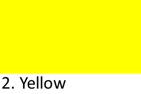
pure primary color of sunlight, the brightest color on the visible spectrum. Yellow symbolizes happiness worldwide, and used for the sun, school buses, ripe bananas, and New York City taxis.
Secondary Color Names in English
Secondary colors are made by mixing two primary colors in equal amounts.
Green
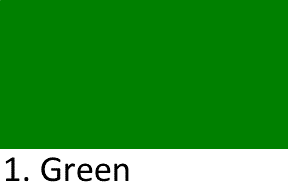
secondary color made by mixing blue and yellow, associated with nature and growth. Green is the color of chlorophyll, symbolizes luck and environment, and shows up on the Irish flag.
Orange
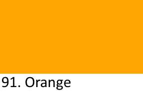
secondary color made by mixing red and yellow, warm and energetic. Orange is the color of the orange fruit, autumn leaves, sunset skies, Halloween pumpkins, and the national color of the Netherlands.
Purple
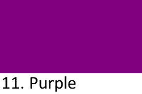
secondary color made by mixing red and blue, associated with royalty and luxury. Purple was the most expensive ancient dye (from Tyrian sea snails), worn only by Roman emperors and Byzantine royalty.
Shades of Red in English
Shades of red are the family of red hues from bright scarlet to deep dark burgundy.
Crimson
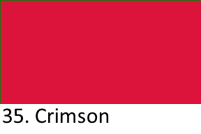
deep rich red with a slight blue undertone, darker than pure red. Crimson is Harvard University’s color, seen in ripe cherries and autumn maple leaves, and named after the ancient kermes insect.
Scarlet
bright vivid red with a slight orange undertone, brighter than crimson. Scarlet is the color of British military uniforms, cardinal robes, ripe strawberries, and the letter A in The Scarlet Letter.
Maroon
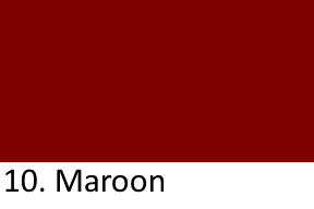
dark red-brown color like dried blood or aged wine, muted and earthy. Maroon is the traditional color of Moroccan fezzes, the university colors of Texas A&M, and the flag of Qatar.
Burgundy
deep purplish-red color named after the French wine region. Burgundy is the color of red wine, peak autumn leaves, luxury leather goods, and a popular fall fashion colors.
Ruby
deep saturated red like the ruby gemstone, one of the four precious stones. Ruby is the birthstone of July, the color of ripe pomegranate seeds, and traditional in Chinese weddings for prosperity.
Cherry Red
bright glossy red like a ripe cherry, warm and cheerful. Cherry red is the classic 1950s American automobile paint color, the color of maraschino cherries, and used across candy packaging worldwide.
Shades of Blue in English
Shades of blue are the family of blue hues from pale sky blue to deep dark navy.
Navy Blue
very dark blue, almost black, named after British Royal Navy uniforms since 1740. Navy blue is the classic business suit, the school uniform color worldwide, and used in dozens of national flags.
Royal Blue
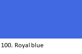
deep bright saturated blue, richer than navy. Royal blue is the color of British royal ceremonial livery, popular in wedding suits, and used on the flags of Israel and Somalia.
Sky Blue
pale bright blue like a cloudless summer sky, calming and light. Sky blue is the traditional color of baby-boy clothing, hospital walls, and the flags of Argentina, Greece, and the UN.
Turquoise
bright blue-green color between sky blue and jade, named after the turquoise gemstone. Turquoise is the color of Caribbean waters, sacred to Native American Southwest tribes, and the birthstone of December.
Teal
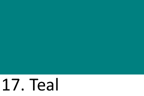
deep blue-green named after the head-color of the teal duck, darker than turquoise. Teal is a popular modern interior design color, common in corporate branding, and a fall fashion favorite.
Cobalt Blue
deep saturated blue with a slight violet undertone, named after the cobalt metal pigment. Cobalt blue is the classic color of Chinese Ming Dynasty porcelain, medieval stained-glass windows, and art deco design.
Cerulean
bright sky blue with a slight green tint. Cerulean is the color of the Mediterranean Sea, the 2000 Pantone Color of the Year, and famously mocked in The Devil Wears Prada movie.
Shades of Green in English
Shades of green are the family of green hues from bright lime to deep dark forest.
Lime Green
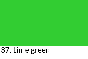
bright yellow-green like the peel of a lime fruit, vibrant and energetic. Lime green is used in high-visibility safety vests, popular in sports team uniforms, and the classic color of highlighter pens.
Olive Green
muted dark yellow-green named after the color of ripe olives. Olive green is the traditional color of military uniforms since World War I, popular in autumn fashion, and a favorite interior color.
Forest Green
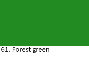
deep dark green like the leaves of a pine forest, rich and natural. Forest green is the color of national park signs, British racing green, and popular in Christmas decoration and menswear.
Emerald Green
vivid pure green like the emerald gemstone, one of the four precious stones. Emerald green is the national color of Ireland (“the Emerald Isle”) and the 2013 Pantone Color of the Year.
Jade Green
muted grey-green like the jade gemstone, calm and elegant. Jade green is sacred in Chinese culture (symbolic of purity), the traditional color of Imperial Chinese art, and popular in modern spa branding.
Shades of Yellow in English
Shades of yellow are the family of yellow hues from bright lemon to warm mustard.
Mustard Yellow
warm brownish-yellow like the color of prepared mustard sauce. Mustard yellow is a popular vintage and 1970s interior design color, the color of French Dijon mustard, and a fall fashion favorite.
Lemon Yellow
bright acidic yellow like a lemon peel, sharp and cheerful. Lemon yellow is the color of childhood joy, popular in children’s toys and kitchen decor, and the classic color of taxi cabs.
Amber
warm golden-orange-yellow color of the fossilized tree resin gemstone. Amber is the color of traffic lights’ middle signal, honey, aged whisky, and the fossils that preserved insects for 100 million years.
Cream Yellow
soft pale off-white yellow like fresh dairy cream, warm and inviting. Cream yellow is a classic paint color for walls, popular in traditional wedding dresses, and the color of 1920s vintage cars.
Butter Yellow
soft rich pale yellow like fresh butter, warmer than cream. Butter yellow is a popular baby-nursery paint color, the traditional color of French farmhouse kitchens, and a school-bus interior color.
Shades of Orange in English
Shades of orange are the family of orange hues from soft salmon to warm terracotta.
Salmon
pale pinkish-orange named after the flesh of salmon fish. Salmon is a popular spring fashion color, the color of tropical sunset skies, and a classic color for men’s shirts and spring dresses.
Apricot
soft warm pinkish-orange named after the color of ripe apricot fruit. Apricot is a popular wedding-decor color, common in bridesmaid dress collections, and used in cosmetics for its warm skin-flattering tone.
Rust
warm reddish-brown-orange like the color of oxidized iron. Rust is a popular fall fashion color, the color of autumn foliage across New England, and popular in modern accent walls and leather furniture.
Tangerine
bright vivid orange like the tangerine fruit, brighter than standard orange. Tangerine is the Pantone Color of the Year 2012, popular in tropical beach fashion, and the color of tropical sunset skies.
Terracotta
warm earthy red-brown-orange like the color of unglazed baked clay pots. Terracotta is the traditional color of Mediterranean roof tiles, ancient Greek pottery, Chinese Terracotta Army sculptures, and modern boho interior design.
Shades of Purple in English
Shades of purple are the family of purple hues from pale lavender to deep dark plum.
Lavender
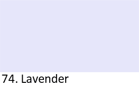
soft pale purple named after the lavender flower. Lavender is the classic color of English cottage gardens, spring weddings, and children’s bedrooms for its calming effect.
Magenta
vibrant bold pink-purple-red color between pink and purple. Magenta is the printing “M” in CMYK color models, named after the 1859 Battle of Magenta in Italy, and a bold branding color.
Violet
pure blue-purple color, one of the seven rainbow colors. Violet is named after the flower, the highest visible color on the light spectrum, and the color of amethyst gemstones.
Plum
deep dark purple named after ripe plum fruit. Plum is a popular fall and winter fashion color, common in modern accent walls, and a classic Victorian-era home decor color.
Lilac
soft pale purple named after the lilac flower. Lilac is a popular spring wedding color, the traditional color of Easter dresses in the American South, and a soft feminine classic.
Indigo
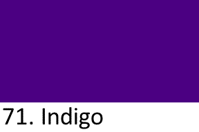
deep dark blue-purple, the sixth rainbow color. Indigo is the color of denim jeans (dyed with indigo plant), one of Newton’s seven rainbow colors, and sacred in Hindu tradition.
Shades of Pink in English
Shades of pink are the family of pink hues from bright hot pink to soft baby pink.
Hot Pink
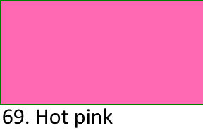
bright vibrant intense pink, warm and energetic. Hot pink is a popular 1980s fashion color, Barbie doll packaging, breast cancer awareness ribbons, and neon signage across nightlife districts.
Rose
soft warm pink named after the rose flower, romantic and elegant. Rose is a popular wedding color, a classic Valentine’s Day color, and used for smartphones and cosmetics.
Fuchsia
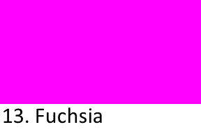
bright vivid purple-pink color, brighter and more pink-purple than magenta. Fuchsia is named after the fuchsia flower (named after botanist Leonhart Fuchs) and popular in tropical fashion and Pacific sunsets.
Coral Pink
warm pink-orange like the color of coral reefs. Coral pink is the Pantone Color of the Year 2019 (Living Coral), popular in spring and summer fashion, and a classic tropical resort color.
Watermelon Pink
bright fresh warm pink like ripe watermelon flesh. Watermelon pink is a popular summer and children’s fashion color, common in lipstick and nail polish lines, and a tropical juice-bar color.
Shades of Brown in English
Shades of brown are the family of brown hues from deep chocolate to soft tan.
Chocolate
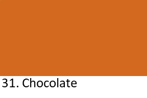
rich deep brown like dark chocolate. Chocolate brown is the traditional color of European heritage leather goods, popular in autumn fashion, and a common hair colors worldwide.
Chestnut
warm reddish-brown like the color of ripe chestnuts. Chestnut is a popular hair color, the traditional color of English riding horses, and a common color name for wooden furniture and leather saddles.
Caramel
warm golden-brown like the color of caramelized sugar. Caramel is a popular hair-highlight color, a common color for leather handbags and shoes, and the color of most cream-in-your-coffee shades.
Tan
pale warm yellowish-brown like sun-tanned skin. Tan is the traditional color of khaki pants, popular in summer and safari fashion, and a common color for men’s dress shoes and belts.
Beige

soft pale off-white brown, neutral and warm. Beige is a classic wall paint color for living rooms, popular in Scandinavian interior design, and a common color for wardrobe essentials like trench coats.
Khaki
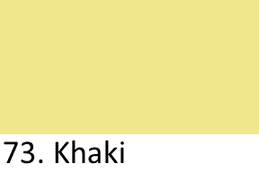
muted dusty yellowish-brown, named after the Persian word for “dust.” Khaki is the traditional color of military desert uniforms since the 1840s, the color of safari pants, and popular in casual chinos.
Shades of Grey in English
Shades of grey are the family of grey hues from deep charcoal to soft dove grey.
Charcoal
very dark grey, almost black, like the color of burnt wood. Charcoal is a classic business-suit color, popular in modern minimalist interior design, and the traditional color of professional office wear.
Slate Grey
medium-dark grey with a slight blue undertone, named after the slate rock. Slate grey is a common roof-tile color, popular in modern kitchen countertops, and a favorite exterior paint for modern homes.
Ash Grey
soft cool light-medium grey like the color of wood ash. Ash grey is a popular modern flooring color, common in trendy hair-coloring styles, and a favorite neutral wall color in Scandinavian design.
Dove Grey
soft warm pale grey like the color of dove feathers. Dove grey is a popular wedding decor color, common in bridal shoe collections, and a classic French country interior design color.
Smoke Grey
soft hazy medium grey with a slight blue undertone. Smoke grey is a popular smartphone finish color, common in modern kitchen appliance colors, and a classic sunglasses tint.
Neutral Color Names in English
Neutral colors are the achromatic shades of black, white, and their soft off-shades used everywhere in design.
Black
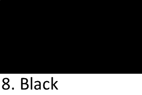
pure absence of color, the darkest color. Black is the color of formal evening wear, mourning in Western cultures, and every screen device.
White

pure combination of all visible light, the brightest color. White is the traditional color of Western wedding dresses, symbolizes purity across cultures, and the color of doctor’s coats and chef’s hats.
Ivory
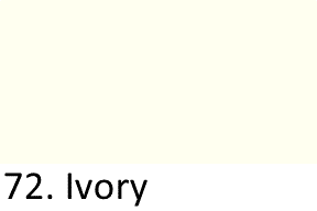
soft warm off-white with a yellow tint, named after elephant tusks. Ivory is a popular wedding-dress color (softer than white), the color of piano keys, and used for bridal shoes.
Off-White
warm neutral white with a cream or grey tint, softer than pure white. Off-white is a popular interior design paint color, common in modern minimalist fashion, and used across every design industry.
Metallic Color Names in English
Metallic colors are the shiny reflective shades of gold, silver, copper, and bronze precious metals.
Gold
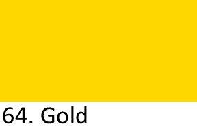
bright metallic yellow like polished gold metal. Gold is the color of the precious metal used in jewelry for 6,000 years, Olympic first-place medals, wedding rings, and luxury goods worldwide.
Silver

bright metallic grey-white like polished silver metal. Silver is the color of the precious metal, Olympic second-place medals, and a popular color for modern jewelry, cutlery, and luxury automobiles.
Copper
warm reddish-brown metallic like polished copper. Copper is the color of the Statue of Liberty before it oxidized to green, popular in modern kitchen cookware, and a classic autumn wedding color.
Bronze
warm brown-metallic color like polished bronze alloy. Bronze is the Olympic third-place medal color, the traditional color of ancient sculptures and cannons, and a popular modern color for sinks and light fixtures.
Pastel Color Names in English
Pastel colors are the soft pale tints of base colors mixed with white, popular for spring, babies, and weddings.
Powder Blue
very pale soft blue like talcum powder. Powder blue is the traditional color of American baby-boy clothing, popular in spring men’s shirts, and classic in wedding groomsmen suits.
Blush Pink
soft warm pale pink like a light facial blush. Blush pink is a popular modern wedding colors, common in bridesmaid dresses, and a classic soft-pink lipstick shade.
Mint Green
soft pale cool green like the color of fresh mint leaves. Mint green is a popular kitchen appliance color, common in vintage 1950s retro interior design, and classic in children’s clothing.
Peach
soft warm pale pinkish-orange like ripe peach skin. Peach is the state color of Georgia, popular in spring wedding decor, and a classic makeup color for warm skin tones.
Baby Blue
very pale soft blue like a spring morning sky. Baby blue is the traditional color of American baby-boy clothing since the 1940s, popular in spring fashion, and used for children’s bedrooms.
Baby Pink
very pale soft pink like a light dusting of rose. Baby pink is the traditional color of American baby-girl clothing since the 1940s, popular in Valentine’s Day decor, and children’s bedrooms.
Neon Color Names in English
Neon colors are the vibrant fluorescent shades that glow, popular in 1980s fashion and safety gear.
Neon Pink
vibrant fluorescent hot pink that glows brighter than any natural pink. Neon pink is a classic 1980s fashion color, common in safety vests and high-visibility gear, and popular in modern club clothing.
Neon Green
vibrant fluorescent yellow-green that glows brighter than natural greens. Neon green is a classic 1980s fashion color, common in high-visibility construction gear, and the traditional color of highlighter pens.
Neon Yellow
vibrant fluorescent bright yellow that glows brighter than any natural yellow. Neon yellow is common in high-visibility safety vests, popular in 1980s retro fashion, and used in tennis balls for court visibility.
Electric Blue
vibrant vivid bright blue with a neon glow, brighter than sky blue. Electric blue is popular in electronic music branding, gaming console lighting, 1980s fashion, and a classic sports car paint color.
Neon Orange
vibrant fluorescent bright orange with a bold glowing effect. Neon orange is common in hunter safety vests (required by law during hunting season), high-visibility work gear, and extreme-sports branding.
Rare and Unique Color Names
Rare and unique color names are the specialized shades used in art, design, and fashion that beginner English learners rarely hear.
Chartreuse
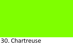
vivid yellow-green color named after the French liqueur made by Carthusian monks since 1737. Chartreuse is one of the most divisive fashion colors and popular in art deco design.
Mauve
soft dusty pale purple with a grey tint, first synthesized as a dye in 1856. Mauve was the world’s first synthetic dye and started a Victorian fashion craze.
Ochre
warm earthy yellow-brown, one of the oldest human pigments. Ochre is the color of prehistoric cave paintings from 40,000 years ago, the traditional color of Australian Aboriginal art, and modern earth-tone interiors.
Vermilion
bright reddish-orange color, brighter than pure red. Vermilion was the classic red pigment of Chinese lacquer, Roman frescoes, and Renaissance oil paintings, and marks Hindu religious foreheads.
Periwinkle
soft pale blue-purple between blue and violet. Periwinkle is named after the flower, popular in spring wedding decor, and the 2022 Pantone Color of the Year (Very Peri).
Colors That Look Similar
Some color names cause confusion for English learners.
Warm vs Cool Colors
| Type | Meaning |
|---|---|
| Warm Colors | Red, orange, yellow, brown that suggest heat and energy |
| Cool Colors | Blue, green, purple that suggest cold and calm |
Warm colors advance visually (they look closer). Cool colors recede (they look farther). Warm colors excite; cool colors relax.
Tint vs Shade vs Tone
| Term | Meaning |
|---|---|
| Tint | Base color + white (baby blue, blush pink, powder blue) |
| Shade | Base color + black (navy blue, forest green, maroon) |
| Tone | Base color + grey (dusty rose, muted blue, sage green) |
Add white to make a tint. Add black to make a shade. Add grey to make a tone. All three are variations of the same base color.
Primary vs Secondary vs Tertiary
| Type | Meaning |
|---|---|
| Primary | Red, blue, yellow (cannot be made by mixing other colors) |
| Secondary | Green, orange, purple (made by mixing two primaries) |
| Tertiary | Red-orange, yellow-orange, yellow-green, blue-green, blue-purple, red-purple |
Primary colors are the foundation. Secondary colors come from mixing two primaries. Tertiary colors come from mixing a primary with an adjacent secondary.
Turquoise vs Teal
| Color | Meaning |
|---|---|
| Turquoise | Bright light blue-green with more blue |
| Teal | Deep dark blue-green with a hint of grey |
Turquoise is lighter and more tropical. Teal is darker and more sophisticated. Both are blue-greens between blue and green.
Magenta vs Fuchsia
| Color | Meaning |
|---|---|
| Magenta | Bright pink-purple with more red |
| Fuchsia | Bright pink-purple with more pink |
Magenta and fuchsia are nearly identical in casual use, but magenta has slightly more red, and fuchsia has slightly more pink. In print (CMYK), magenta is the official process color.
Grey vs Gray
| Spelling | Where Used |
|---|---|
| Grey | British English, Australia, New Zealand, most Commonwealth countries |
| Gray | American English |
Both spellings mean the same color. British spells it “grey”; American spells it “gray.”
FAQs
Q1. How many main color names are there in English?
English has 11 main color names recognized by linguistics research (Berlin and Kay 1969): black, white, red, green, yellow, blue, brown, pink, purple, orange, and grey. Every other color name (crimson, navy, mint, etc.) is a shade of one of these 11 categories.
Q2. What is the difference between a tint, a shade, and a tone?
A tint is a color mixed with white (baby blue, blush pink, powder blue). A shade is a color mixed with black (navy blue, forest green, maroon). A tone is a color mixed with grey (dusty rose, muted blue, sage green). All three are variations of the same base color at different lightness levels.
Q3. What are the primary, secondary, and tertiary colors?
The 3 primary colors are red, blue, and yellow (they cannot be made by mixing others). The 3 secondary colors are green, orange, and purple (each made by mixing two primaries). The 6 tertiary colors are red-orange, yellow-orange, yellow-green, blue-green, blue-purple, and red-purple (each made by mixing a primary with a neighboring secondary on the color wheel).
Q4. What is the difference between warm and cool colors?
Warm colors (red, orange, yellow, brown) suggest heat, fire, and energy. Cool colors (blue, green, purple) suggest cold, water, sky, and calm. In interior design, warm colors make rooms feel smaller and cozier; cool colors make rooms feel larger and more relaxing.
Q5. What is the difference between grey and gray spelling?
Grey and gray are the same color spelled two different ways. Grey is the British English spelling used across the UK, Australia, New Zealand, and most Commonwealth countries. Gray is the American English spelling used in the United States. Both are correct; the choice depends on the writer’s variety of English.
Q6. What is the difference between magenta and fuchsia?
Magenta and fuchsia are nearly identical bright pink-purple colors. Magenta has slightly more red, is the official process color in CMYK printing, and is named after the 1859 Battle of Magenta in Italy. Fuchsia has slightly more pink and is named after the fuchsia flower (which is named after botanist Leonhart Fuchs). In casual use, the two names are interchangeable.

Leave a Comment